Web accessibility for photosensitive people
This study introduces concepts behind making web content accessible for those with vestibular disorders, and how to measure and prevent content leading to seizures and/or other physical reactions. When people think about designing a website, seldom does web accessibility pop into the mind. However, it definitely should.


Overview
Seizures caused by light are known as photosensitive epilepsy. Content that flickers, flashes, or blinks can trigger photosensitive epilepsy. Web technologies that use video, animated gifs, animated pngs, animated SVGs, Canvas, and CSS or JavaScript animations are all capable of content that can induce seizures or other incapacitating physical reactions. Certain visual patterns, especially stripes, can also cause physical reactions even though they are not animated. Photosensitive epilepsy is actually a kind of "reflex epilepsy"—seizures occurring in response to a trigger. In the case of photosensitive epilepsy, seizures are triggered specifically by flashing lights, but other types of reflex epilepsies may be triggered by the act of reading, or by noises. Patterns and images can also trigger epilepsy.
Points to remember
• Certain visual images, even in the absence of motion or flicker, can trigger seizures in patients with photosensitive epilepsy.
• Although static images are possible as triggers, they are less consistent. The trigger that is well established and strong is flashing/strobe lights.
•Seizures most definitely can be and are fatal, and developers and designers are incredibly important for making the web a safer place for those with sensitivities to photosensitive or musicogenic triggers.

Design principles for visual accessibility
• Color is not used as the only visual means of conveying information.
○ Example: “Acetylcholine is represented by blue circles and norepinephrine is represented by orange circles” relies on users being able to distinguish between the colors. “Acetylcholine is represented by blue squares and norepinephrine is represented by orange circles” is a better option.
○ Information conveyed using color alone can cause problems for users with a range of visual impairments, or those using dark modes or screen readers.

Acetylcholine represented by blue squares and norepinephrine represented by orange circles will be a better option unlike this image where one has to rely on color to identify.
• The visual presentation of text has a contrast ratio of at least 7:1, or 4.5:1 for large text.
○ Light text on a dark background is easier to read for many people with a range of visual impairments than dark on light. It can also be more comfortable for people working at a screen for extended periods.
○ A background color must be specified in order to evaluate the contrast ratio. Images with transparent backgrounds can be incompatible with some user accessibility tools.

Light text on a dark background is easier to read for many people.
• Information is conveyed using text rather than images of text.
○ When this is not possible, include the text in an image caption or embedded in the alt text to ensure that it is accessible to users with screen readers.
○ Images are supplemented with text and descriptive captions, ensuring that students can still progress through the content if they can’t see the image.

The Star wars homepage is a good example of captioning the images.
• Avoid high-contrast patterns such as fine stripes and spirals.
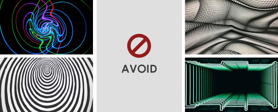
Certain visual patterns, especially stripes, can also cause physical reactions even though they are not animated.
• Do no harm-
WCAG Guideline 2.3 Seizures and Physical Reactions provides an overview: "Do not design content in a way that is known to cause seizures or physical reactions". Don't include animation that a user cannot control. Don't design with patterns known to cause problems. If you must include a gif or png with flashing in it, record it in a video format instead so that controls are available to the user. Give the user the ability to avoid it, turn it off, or render it less harmful.

TikTok is adding a new feature that will help people who have epilepsy to avoid potentially dangerous photosensitive content.
Learning the basics of visual accessibility
All designers should learn the essentials of accessibility so they can make sure their products are usable by everyone. There are endless resources online to learn about accessibility and inclusive design. Here are a few that stand out.
1.Teach Access tutorials
Many recommend Teach Access’s tutorials for basic accessibility training. Whether you are new to accessibility or you just need a refresher, Teach Access provides best practices to write and design accessible software. Founded in 2015, Teach Access is a collaboration by tech companies including Adobe, Facebook, LinkedIn, and Microsoft, academic institutions, and accessibility advocates.
2.webAIM.org
WebAIM is a non-profit organization dedicated to improving the lives of children and adults with disabilities. The site contains a series of software tools, guidelines, research, and training to create web content for people with visual, hearing, motor, and cognitive disabilities.
Internationally recognized accessibility expert Derek Featherstone walks through examples of common web interaction flows, and then steps through considerations and tactical strategies for each component, to assure that people with disabilities can easily complete those tasks. Learn the proper use of color, contrast, and motion, and find out how to design keyboard interactions and touch interfaces; incorporate images, sound, and video; design accessible forms; structure content at the tag level; and balance responsive design with accessibility.
4. Stark
Stark makes it effortless to design and build accessible products from the start by providing you the right tools right where you need them: your design and dev software of choice. Designer, PMs and Engineers use Stark to check on UI elements and code to ensure they are accessible and meet legal requirements and standards.


References
https://webaim.org/blog/wcag-2-0-and-link-colors/
https://developer.mozilla.org/en-US/docs/Web/Accessibility/Seizure_disorders
http://colorsafe.co/
https://www.adweek.com/performance-marketing/tiktok-to-warn-users-before-they-view-potentially-photosensitive-content/
https://www.adinstruments.com/blog/talking-teaching-photosensitivity-and-visually-accessible-course-design
https://xd.adobe.com/ideas/principles/web-design/accessibility-design-at-scale/
Web accessibility is essential for some, but useful for all. Here’s to a more inclusive future!


